Energy data that nobody understood — redesigned to be actually readable.
The RAE Energy Cost Calculator helps households and businesses estimate and manage their energy expenses across multiple sources. The original tool was functionally sound but visually and experientially broken — users couldn't interpret their results, generating a flood of support tickets.
My role was a ground-up UX redesign focusing on data clarity, intuitive input flows, and meaningful visualisations that translated complex energy data into actionable insights.
Mobile view
Users got their results and immediately called support — because the data made no sense to them.
Incomprehensible data visualisations
Charts displayed raw kWh figures without context. Users couldn't map numbers to real-world costs or understand trends over time.
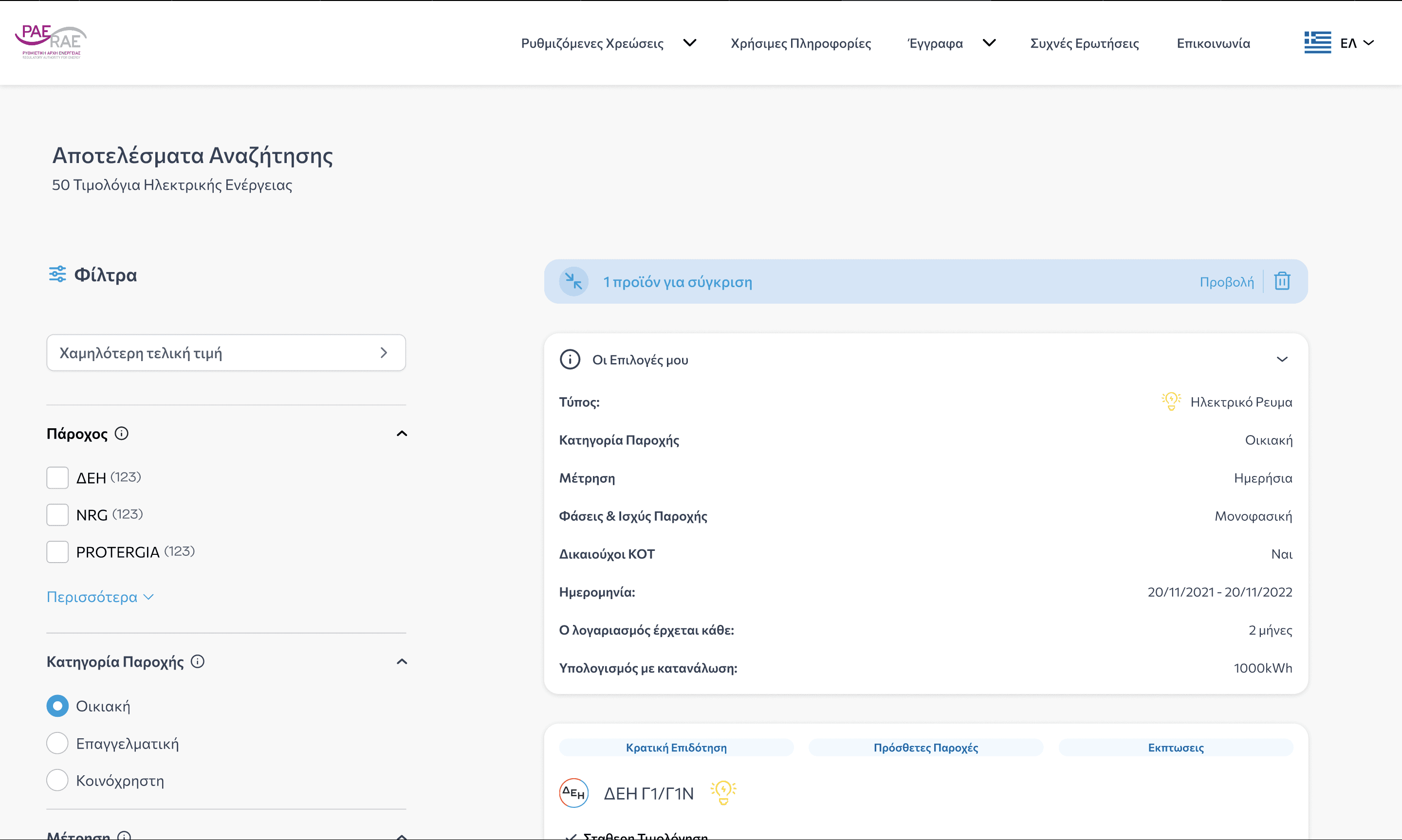
Confusing input flows
The input form requested technical terms (tariff codes, meter IDs) without explanation — deterring non-expert users immediately.
No actionable output
Results were displayed as static tables. There were no recommendations, comparisons, or next steps — leaving users unsure what to do with the information.
Research
Support ticket analysis, user interviews, and benchmarking against similar energy tools in the EU market.
Data Strategy
Worked with engineers to understand what data was available and how it could be presented meaningfully.
Design
High-fidelity Figma designs for input flows and dashboard views. Focus on progressive disclosure and plain language.
Validate
Task-based usability tests measuring comprehension — can users correctly interpret their results unaided?
Plain-language input with contextual help
Technical fields replaced with plain descriptions and inline explainers. "Tariff code" became "Your electricity plan" with a lookup tool.
Real-time cost feedback
As users fill inputs, estimated monthly cost updates instantly — giving immediate reward and encouraging completion.
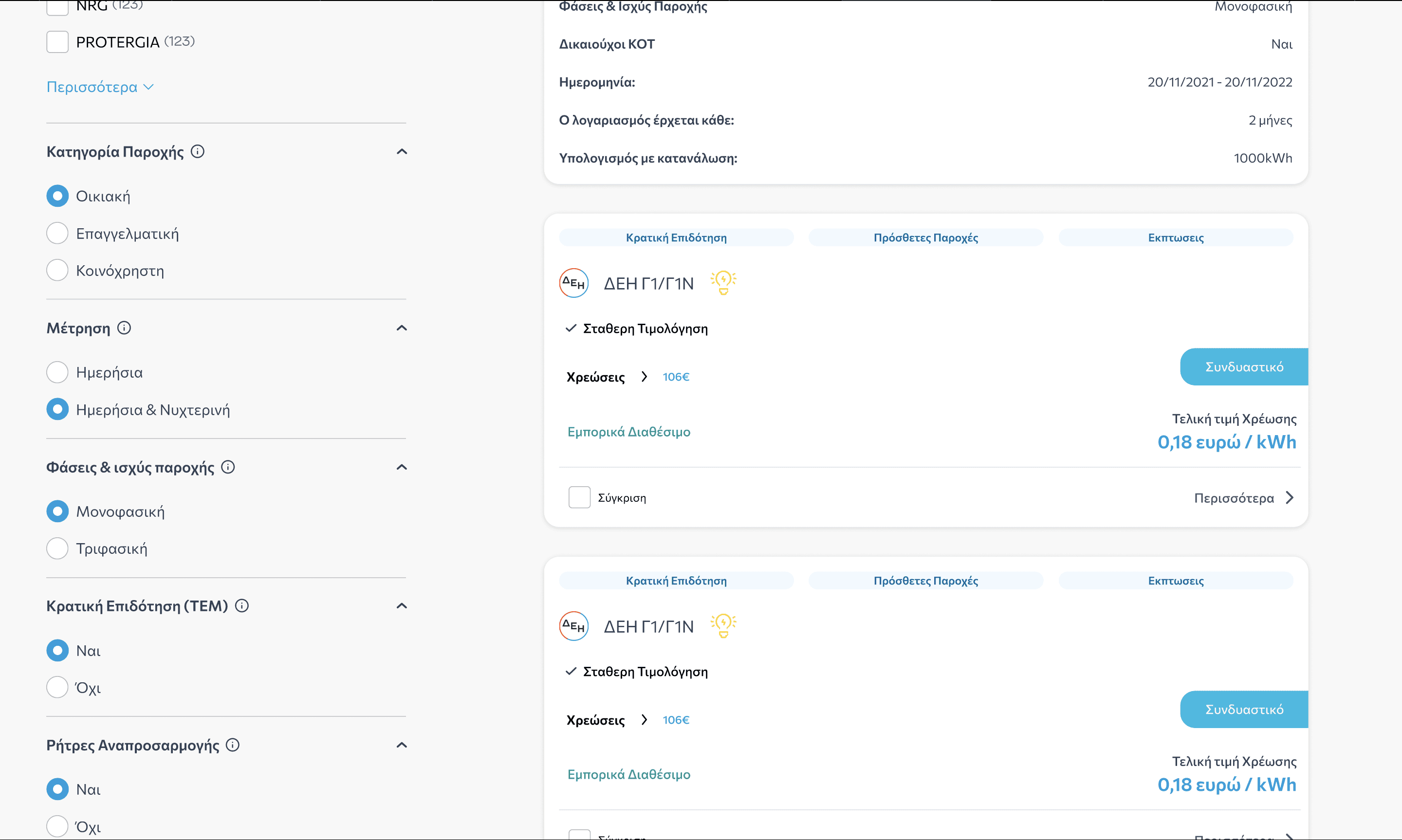
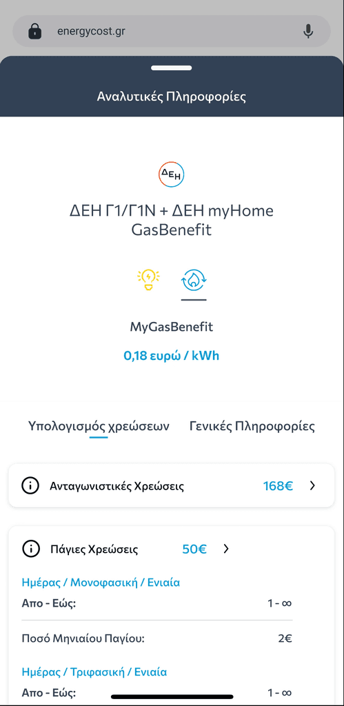
Contextualised data visualisation
Charts show costs vs national average, vs last period, and vs renewable alternatives — transforming raw data into decisions.
Actionable recommendations
Based on consumption patterns, the tool surfaces 3 personalised tips — reducing support dependency and increasing perceived value.
The redesign transformed a support burden into a self-service tool users praised. Comprehension jumped 85% in task-based testing, and the 45% drop in support tickets provided a direct, measurable ROI from design investment.